A series of seasonal fashion and portrait campaigns for Betty Blue’s Loungerie & Bridal, created across several locations, moods and visual stories.
The work treated each campaign as its own editorial world, using setting, styling, pose, colour and supporting design material to give the collection atmosphere beyond straightforward product photography.
Role
- Creative direction
- Art direction
- Campaign and session concepts
- Portrait and pose direction
- Location-led visual treatment
- Styling and setting direction
- Image selection and sequencing
- Editorial presentation
Seasonal campaigns
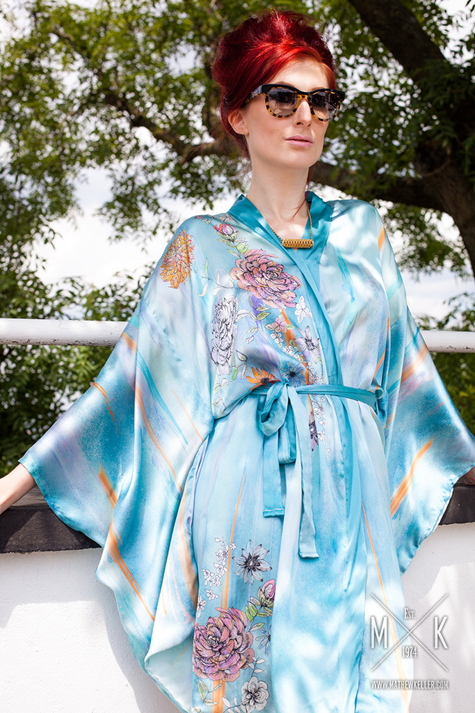
The Betty Blue’s work developed across several seasonal campaigns, each built around a distinct setting and visual mood.
Photography, booklet layouts and web presentation were treated as connected parts of the same campaign language, rather than separate pieces of output.
Spring/Summer 2015
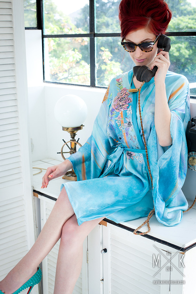
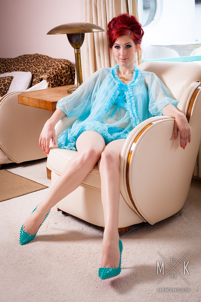
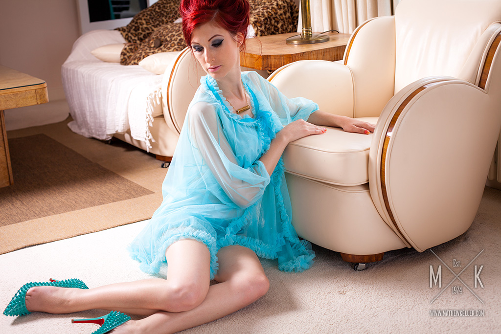
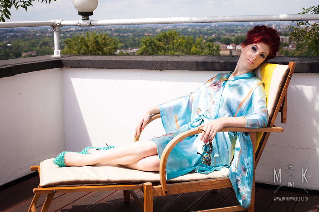
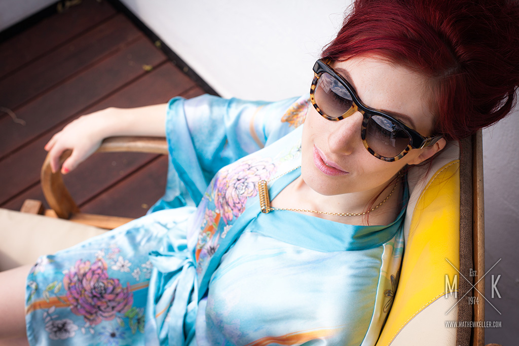
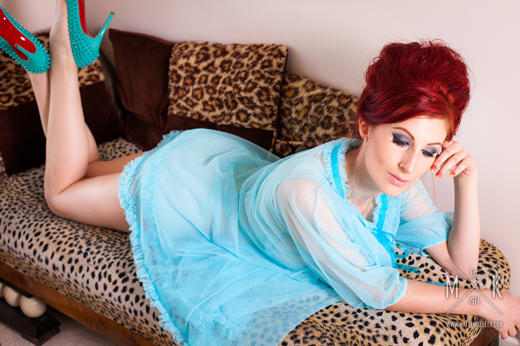
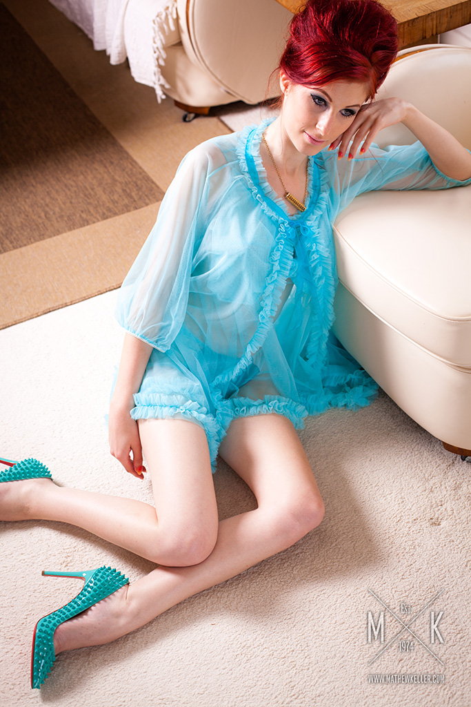
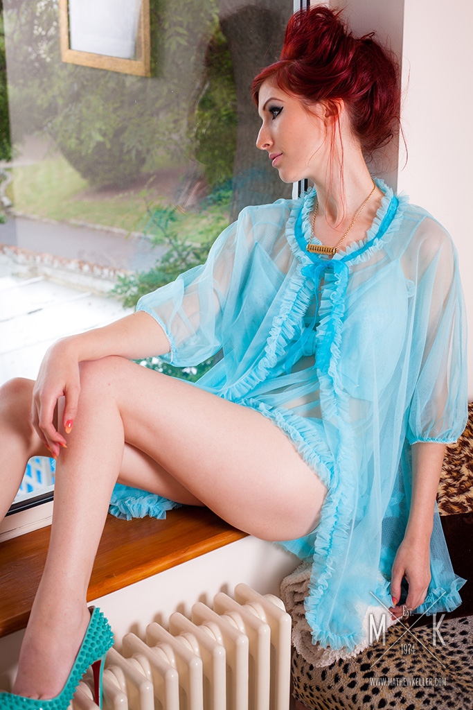
The Spring/Summer 2015 campaign used a warm interior setting to create a softer, more intimate mood around the collection.
The direction leaned into domestic detail, vintage texture and relaxed portrait styling, giving the garments a sense of character and atmosphere rather than treating them as isolated catalogue pieces.

Autumn/Winter 2015
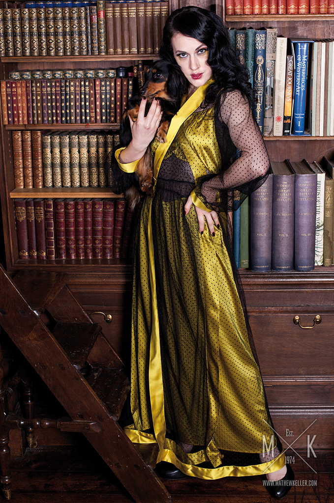
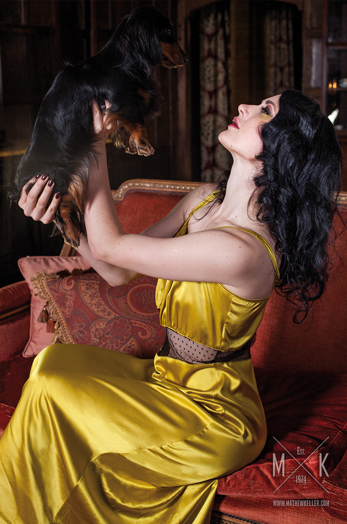
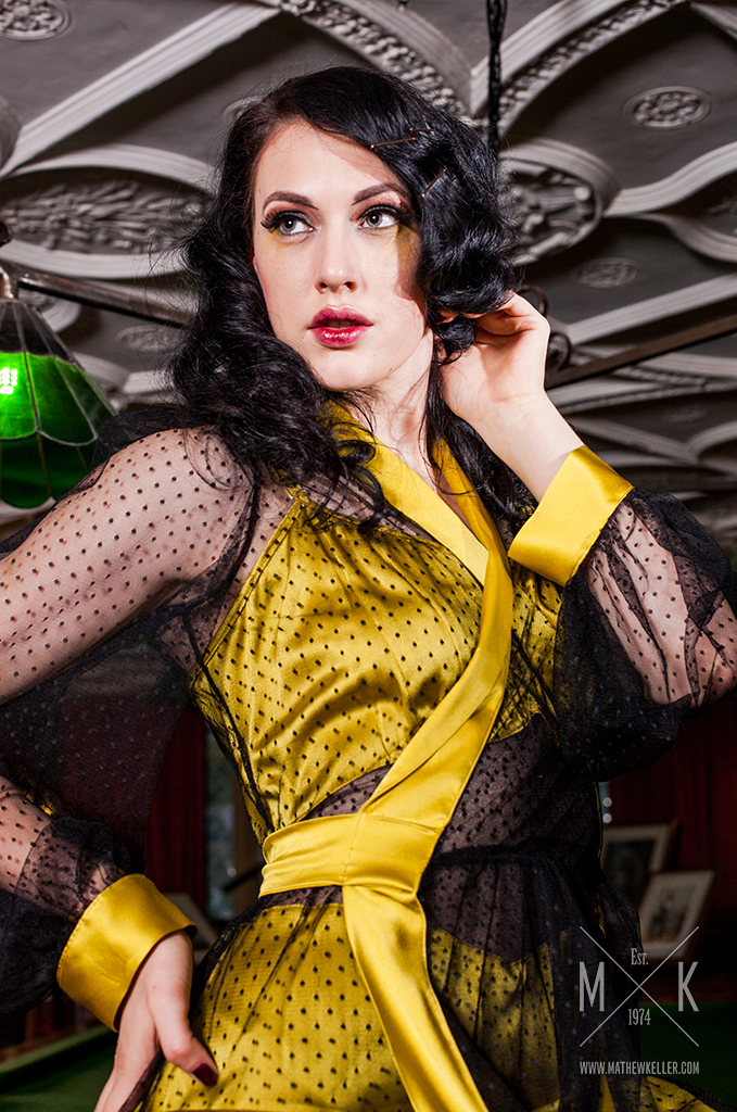
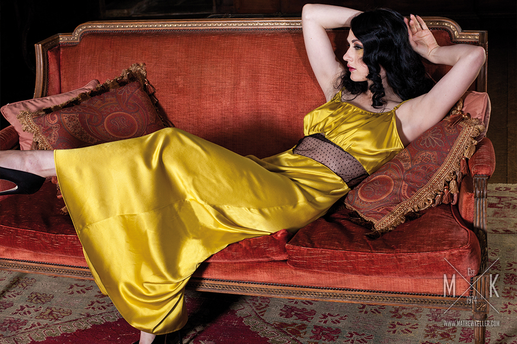
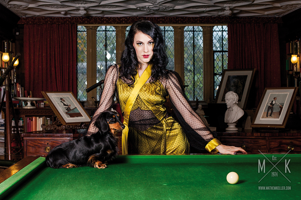
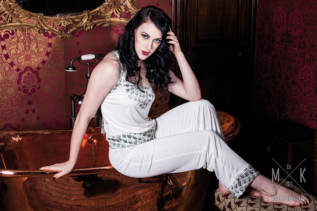
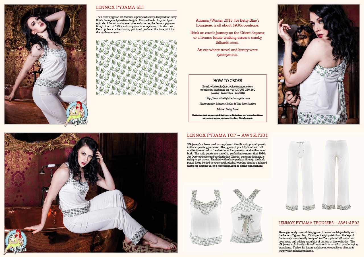
The Autumn/Winter 2015 campaign moved the Betty Blue’s world into richer, more dramatic interiors, using library shelves, tiled bathrooms, patterned surfaces and period detail to give the collection a darker editorial mood.
The direction treated each setting as part of the same seasonal world, shifting between intimacy, theatricality and vintage character while keeping the garments connected through colour, pose, styling and atmosphere.
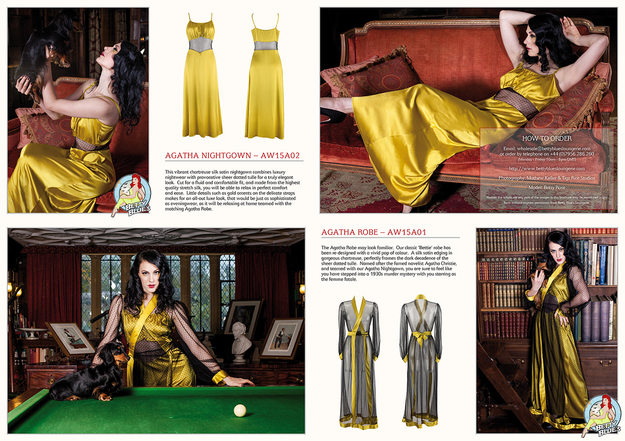
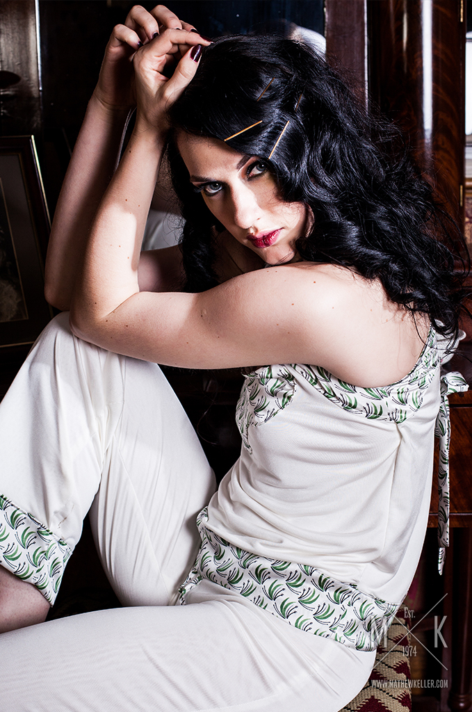
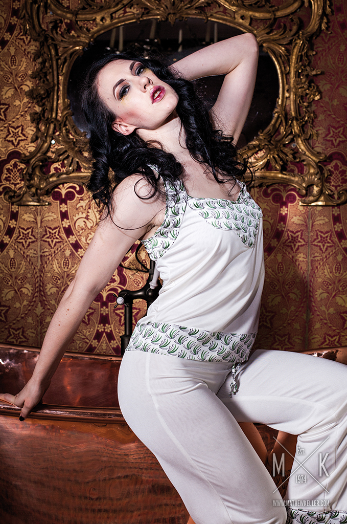
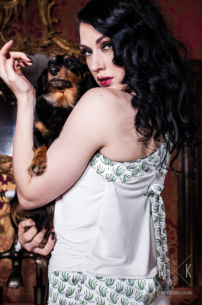
Autumn/Winter 2015: Bridal
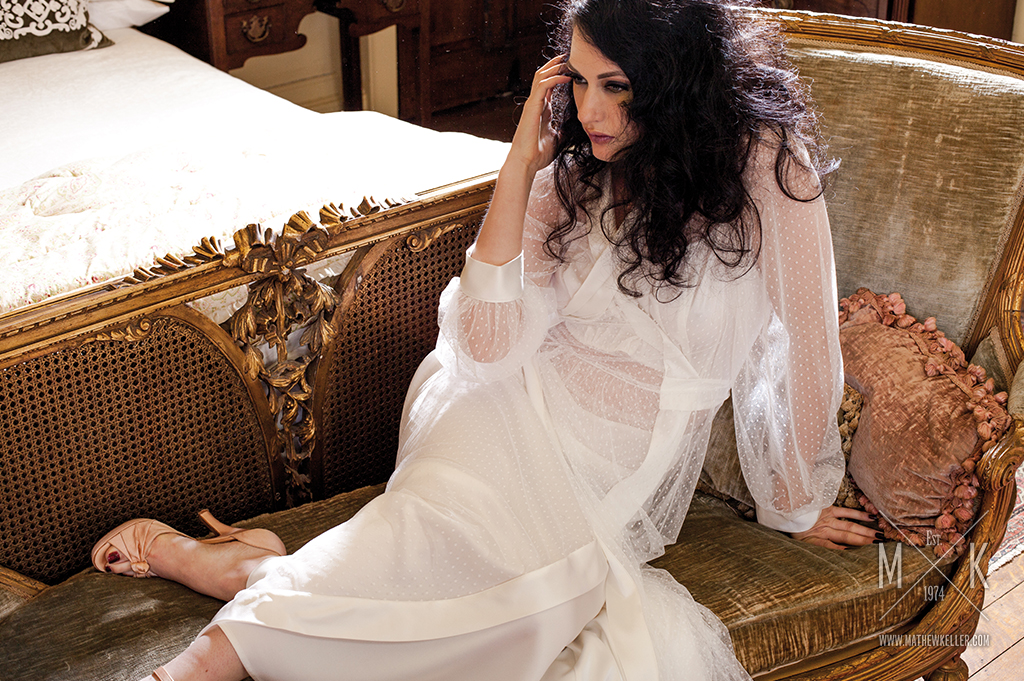
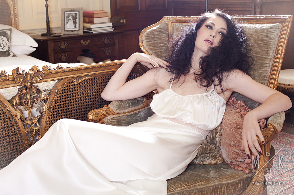
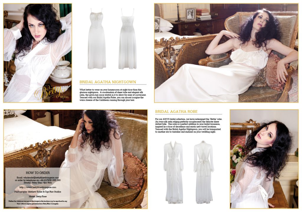
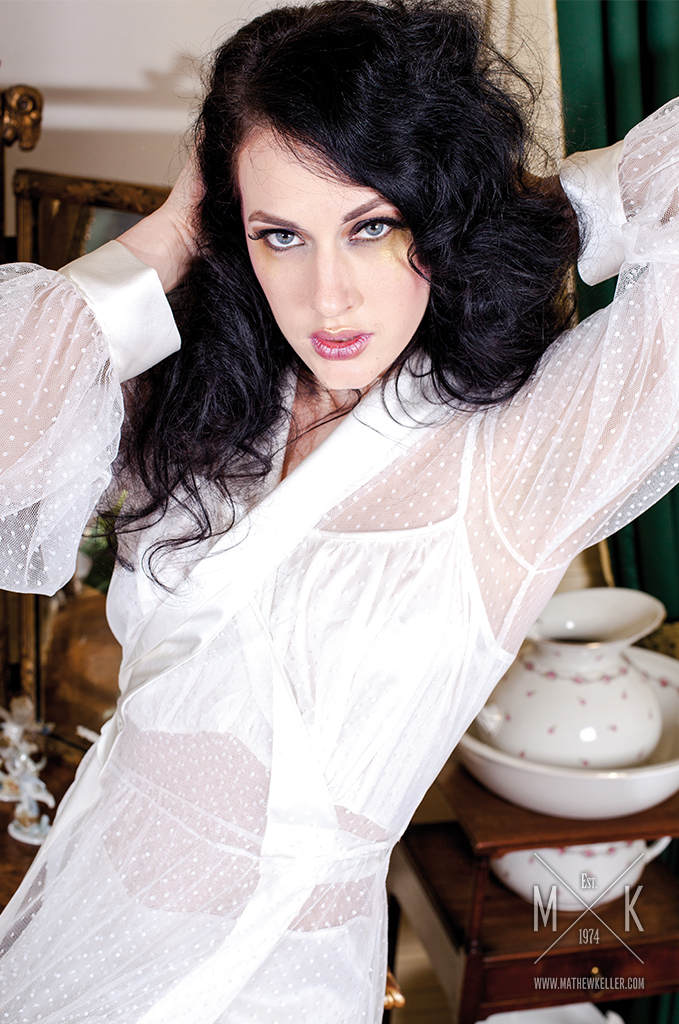
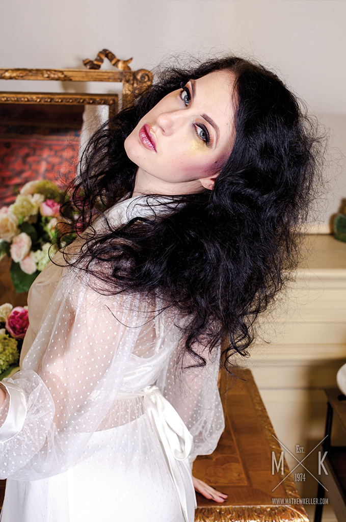
The bridal collection took a softer approach to the Autumn/Winter campaign, using delicate fabrics, ornate furnishings and intimate portraiture to create a romantic atmosphere.
The setting and styling brought a sense of occasion to the collection while retaining the vintage character of Betty Blue’s.
Spring/Summer 2017
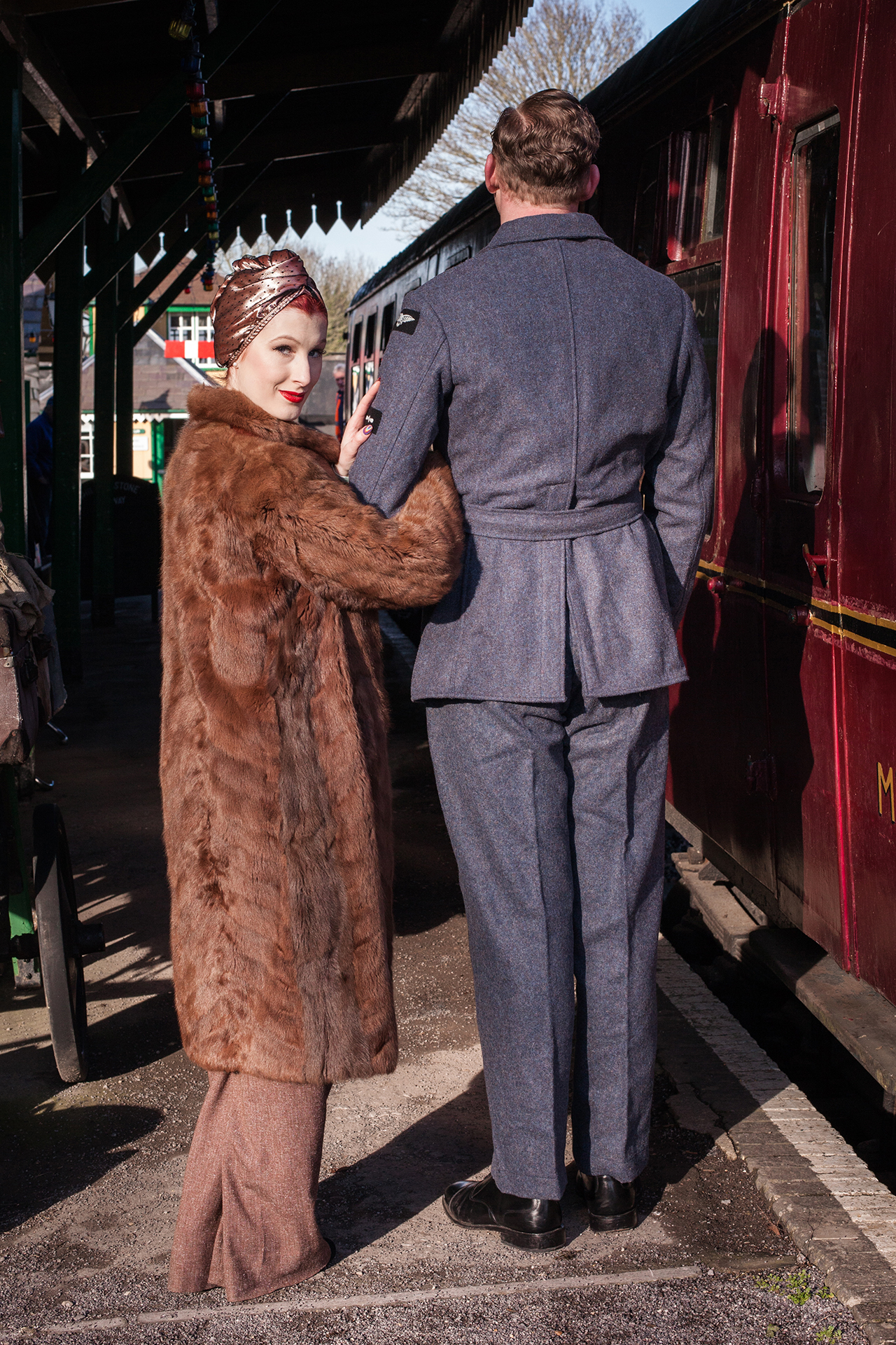
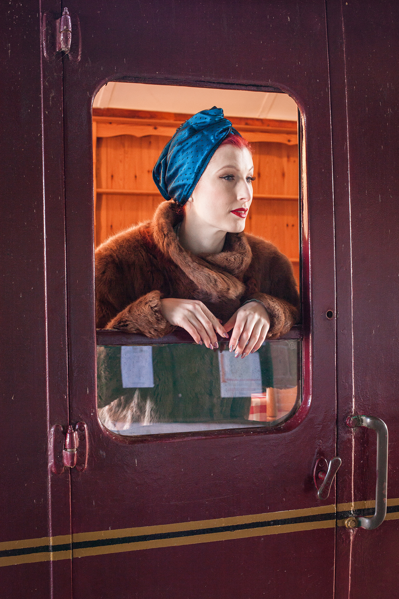
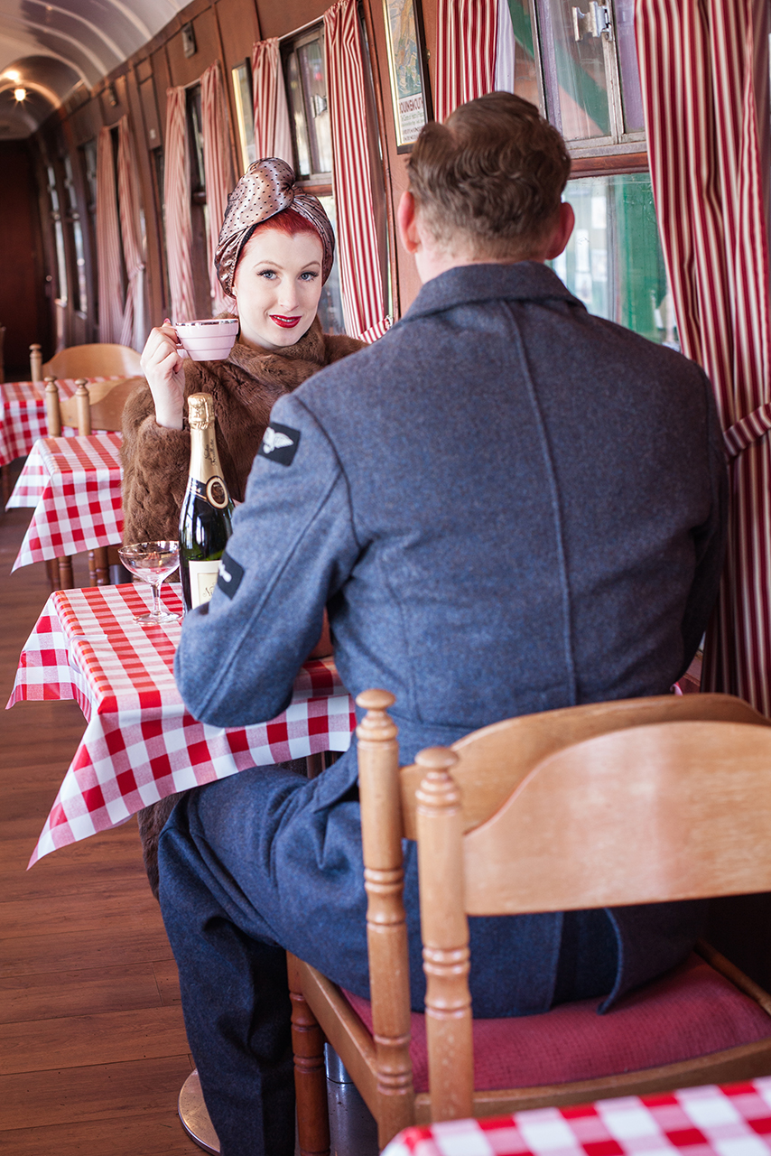
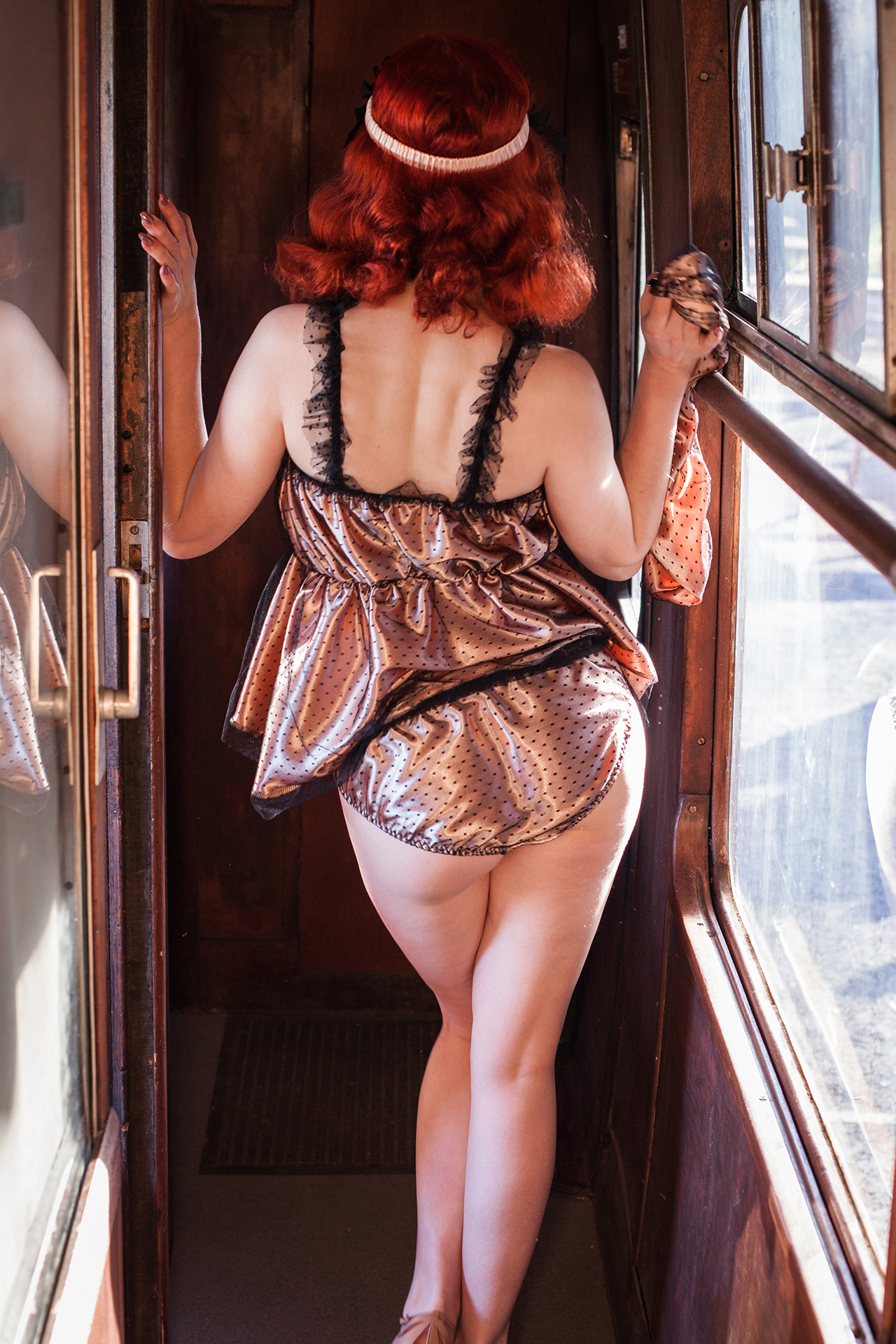
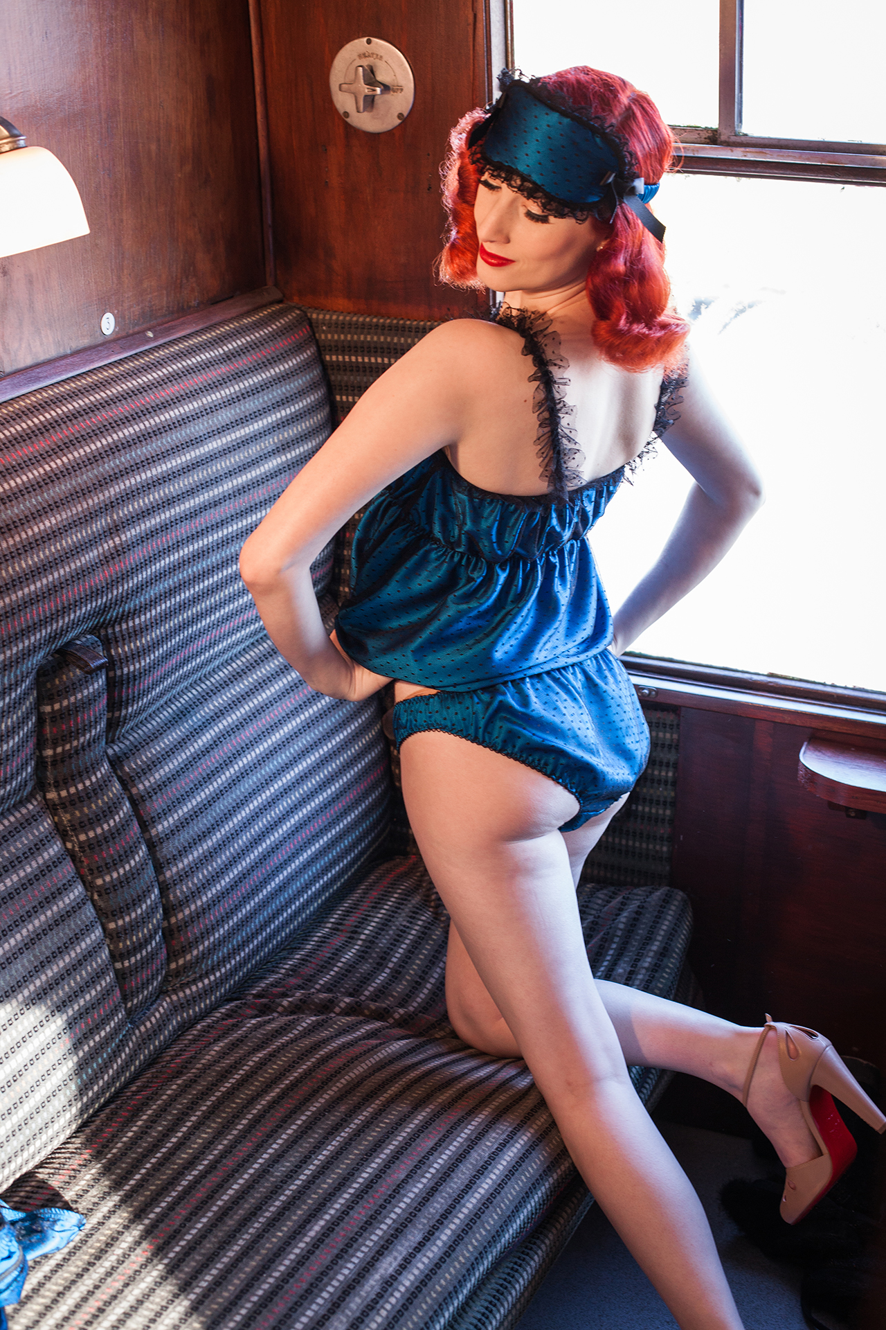
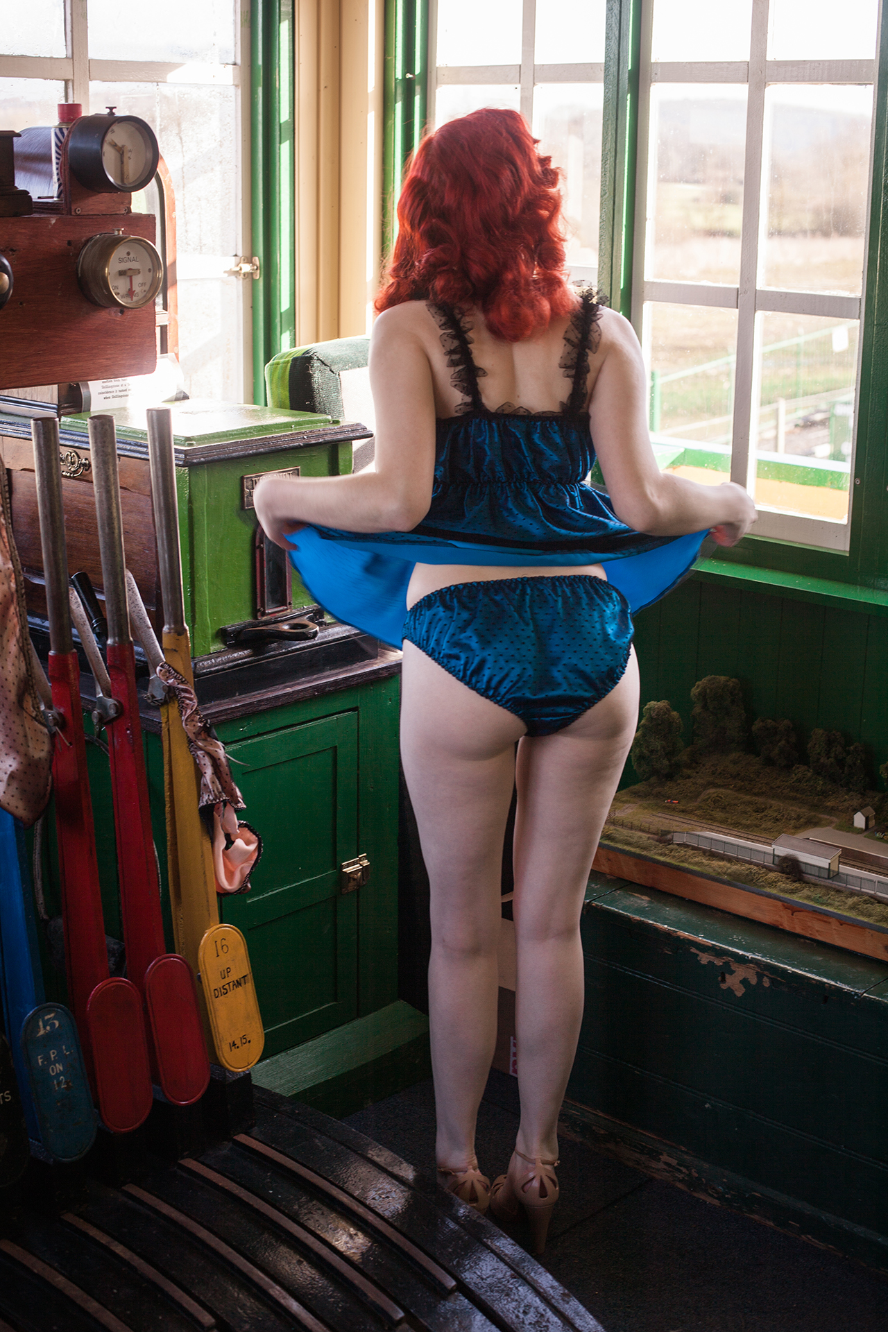
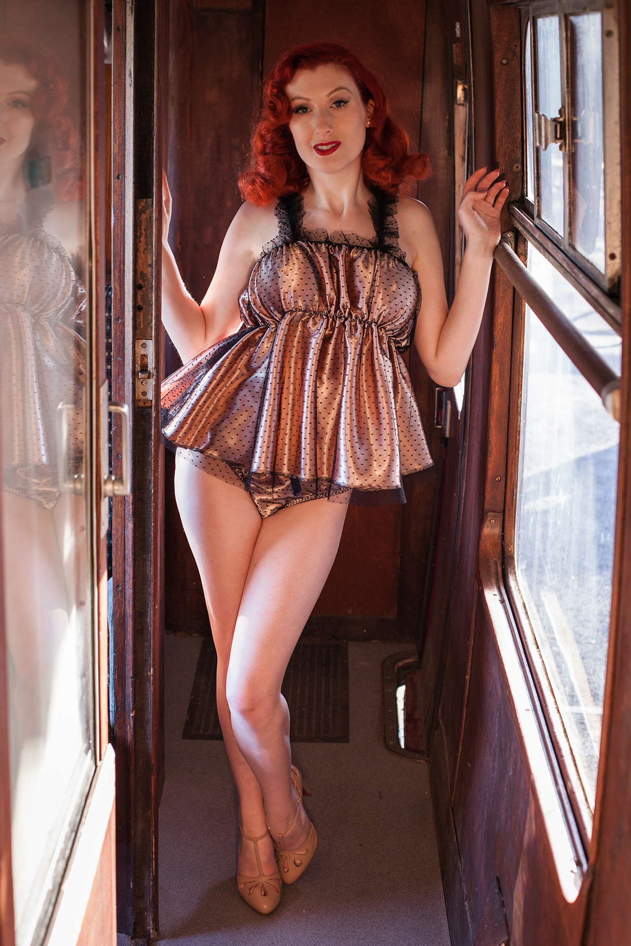
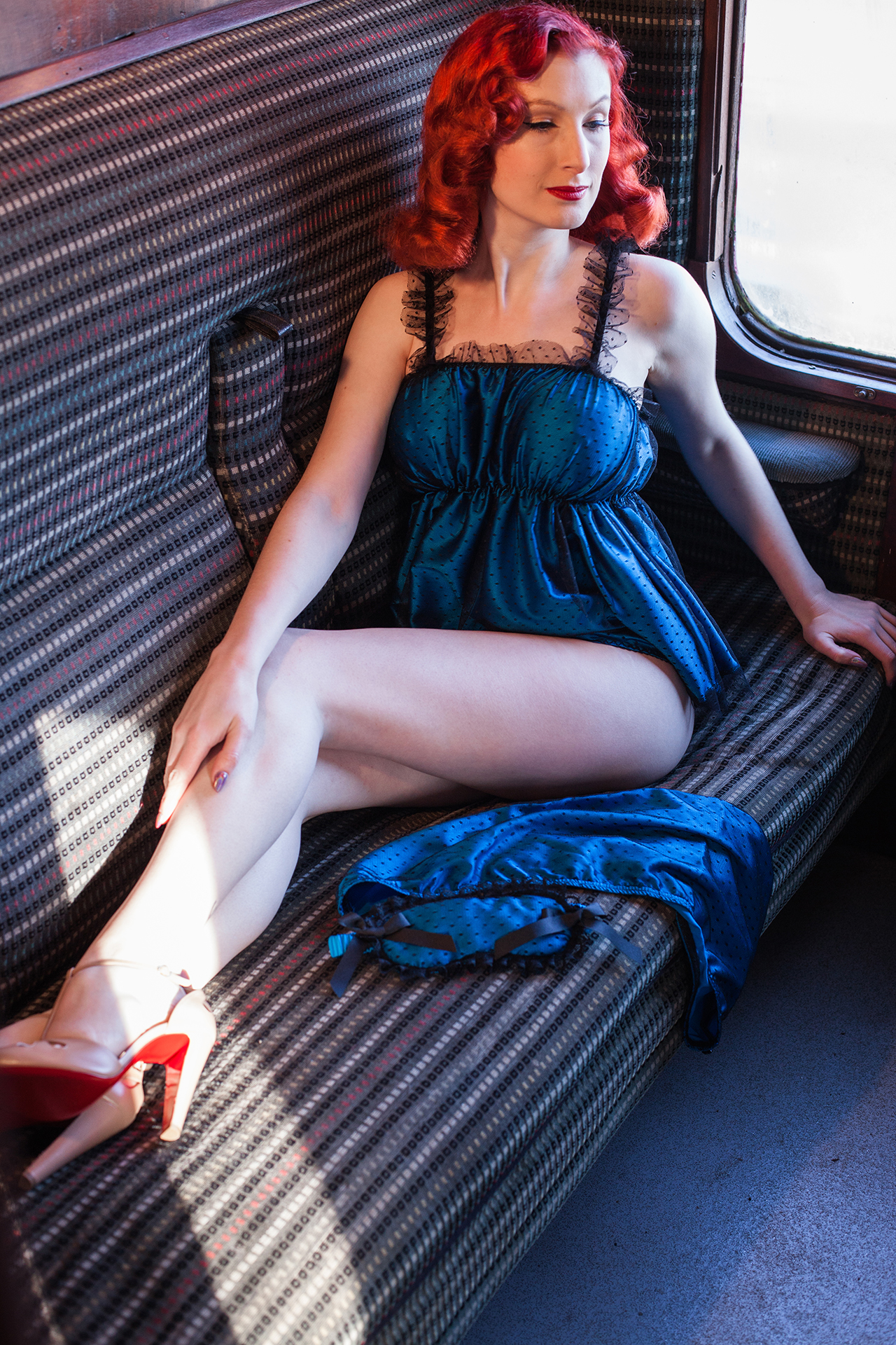
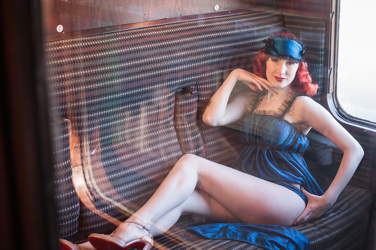
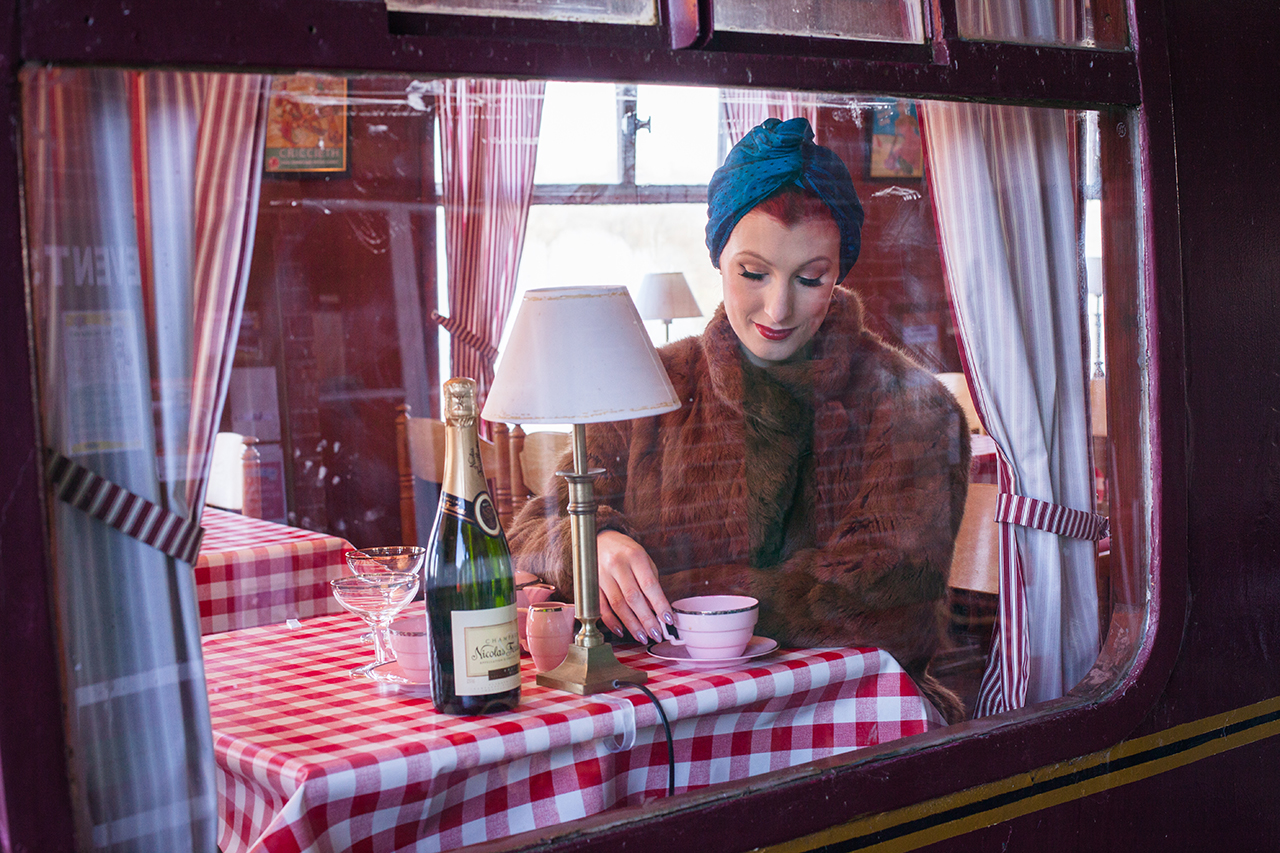
The Spring/Summer 2017 campaign moved the Betty Blue’s world into a more open, location-led setting, using railway details, travel cues and period atmosphere to give the collection a stronger sense of movement and story.
Moving away from the interiors of the previous campaigns, the railway setting introduced a sense of travel, departure and anticipation. The styling, poses and locations worked together to suggest a narrative around the garments rather than a straightforward product shoot.
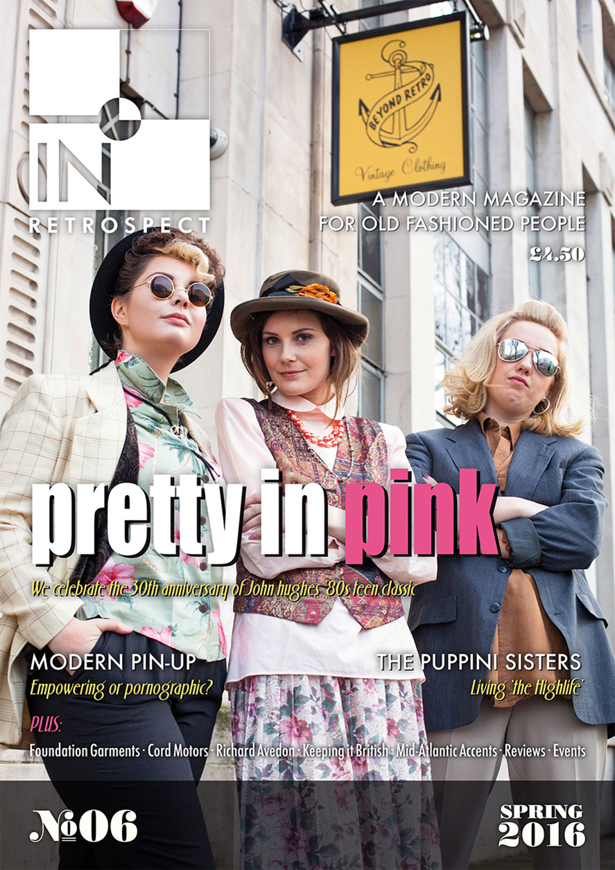
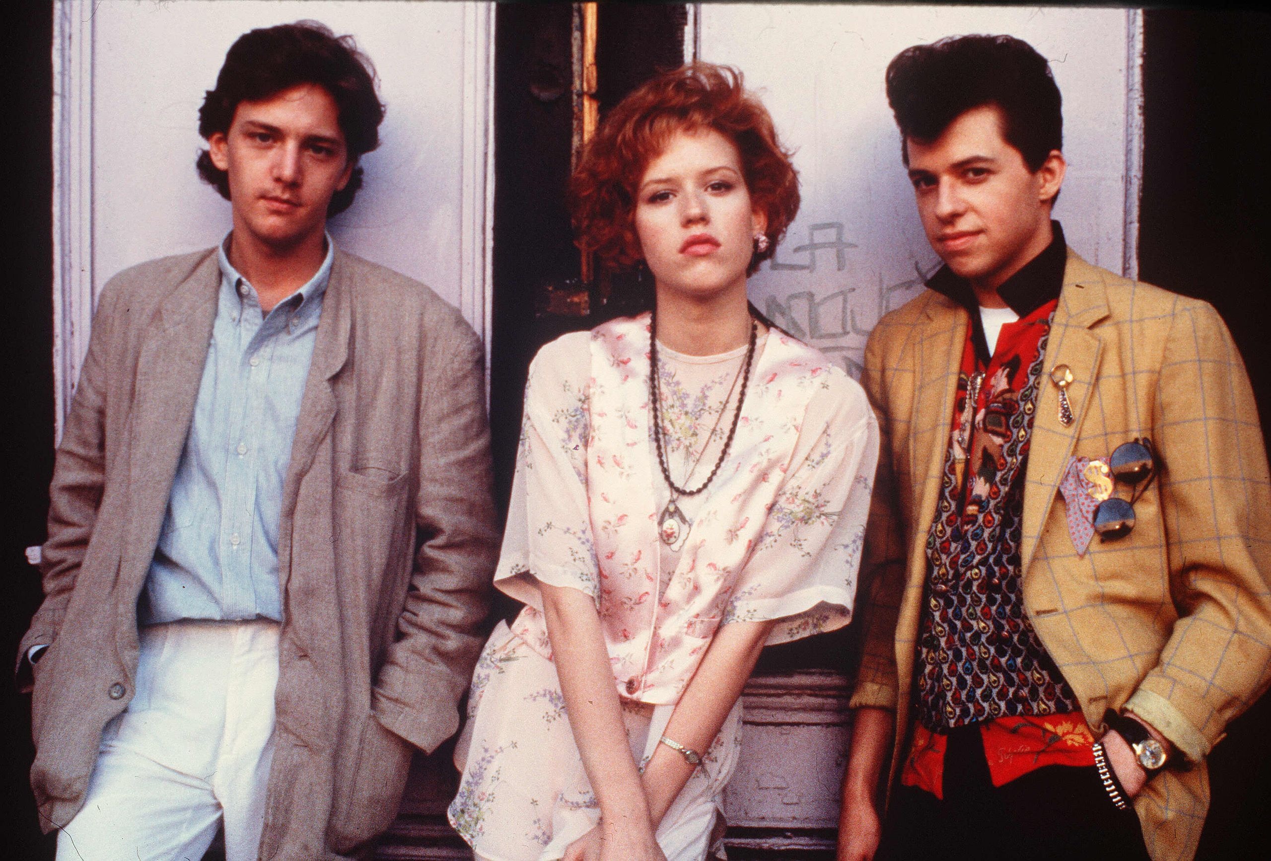
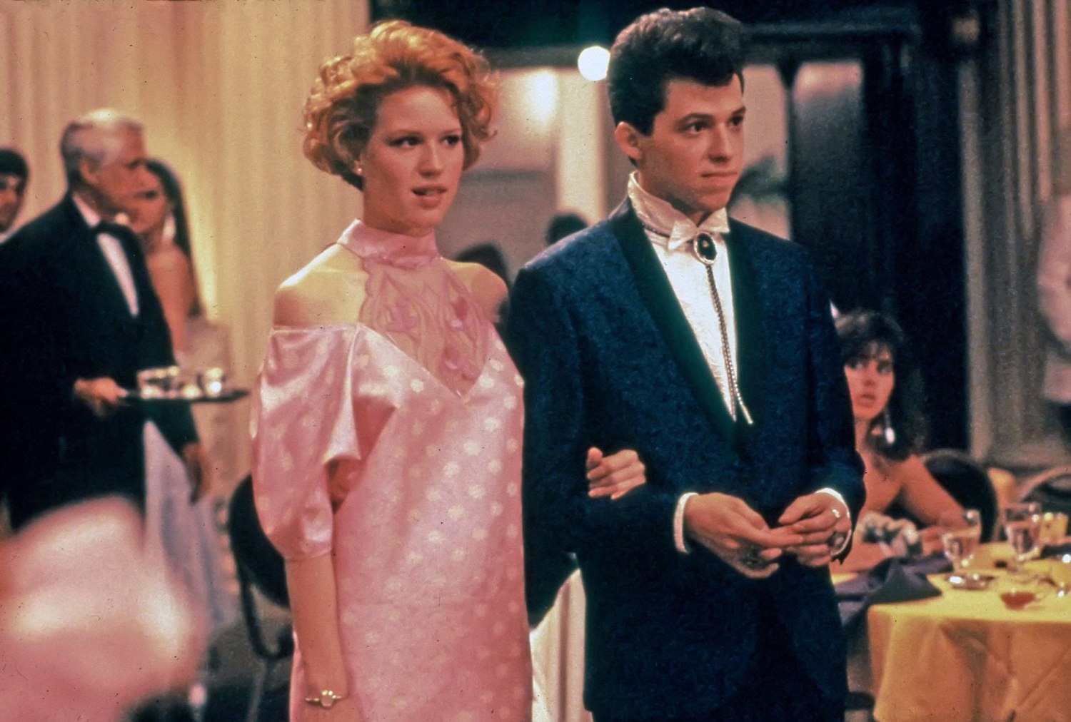
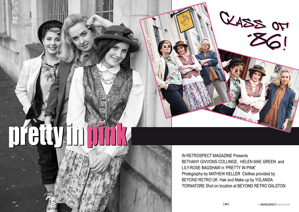
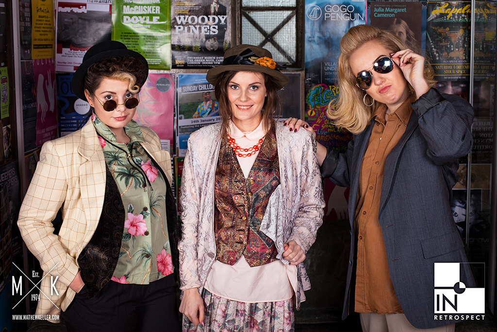
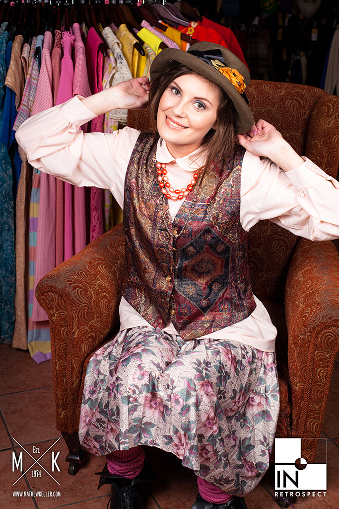
An editorial cover shoot for In Retrospect Magazine, created in collaboration with Beyond Retro to mark the 30th anniversary of Pretty in Pink.
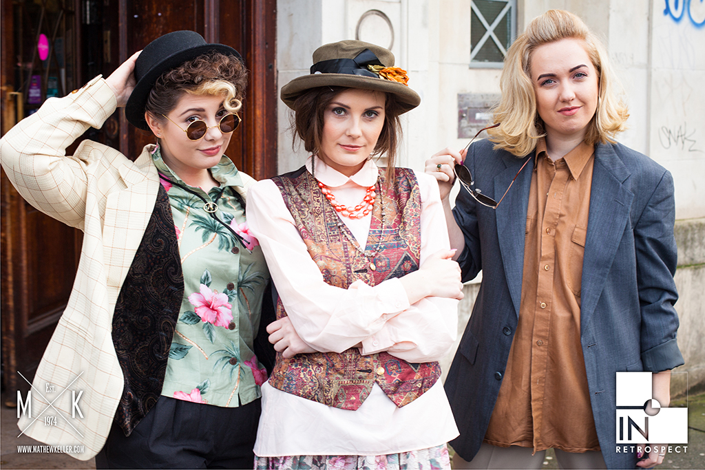
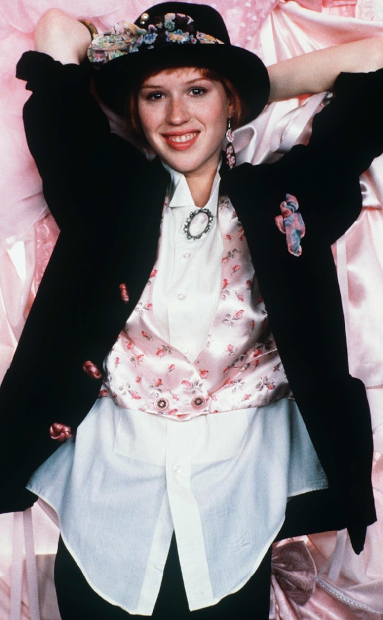
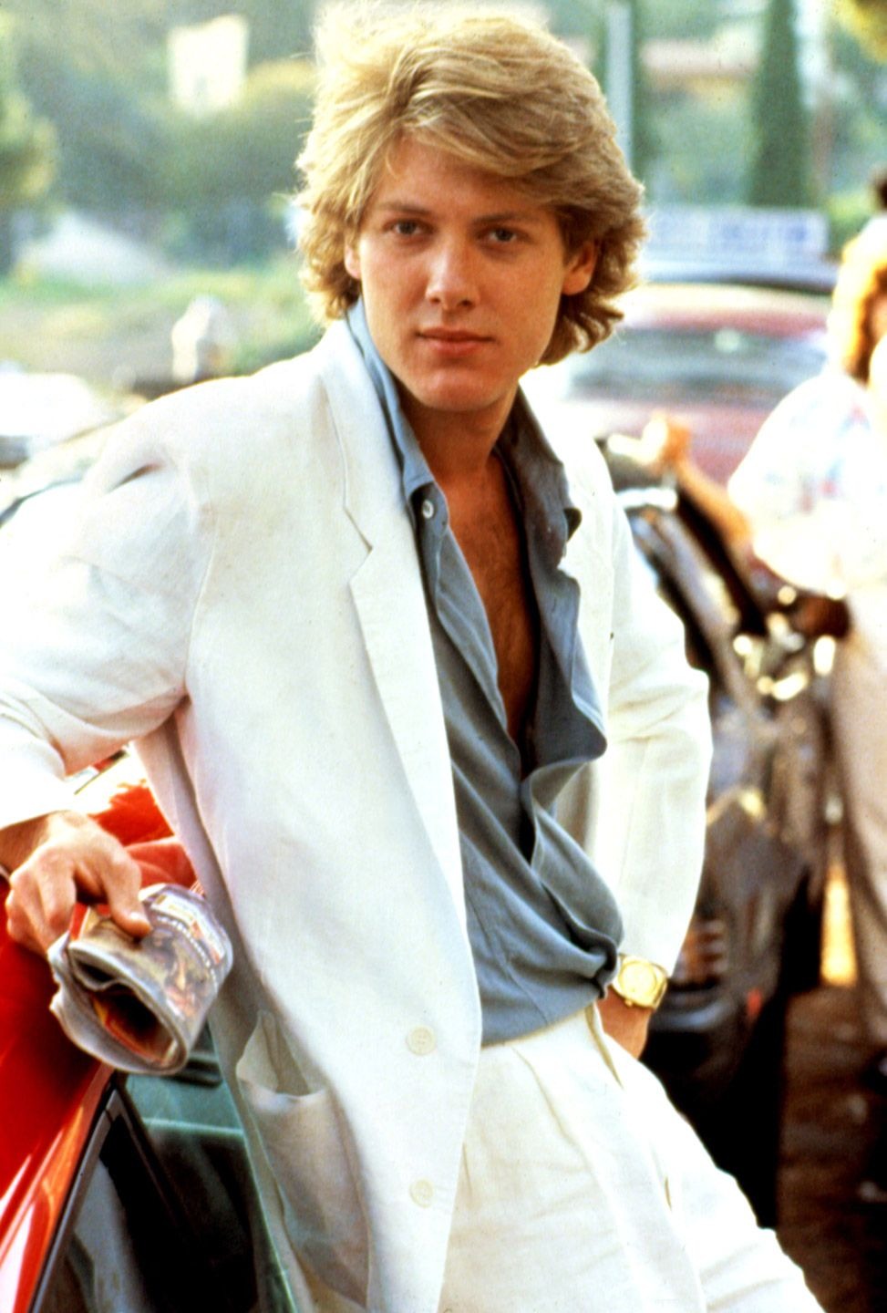
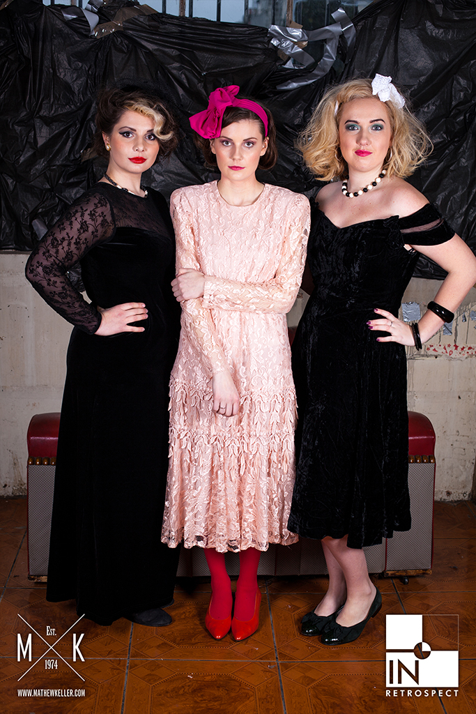
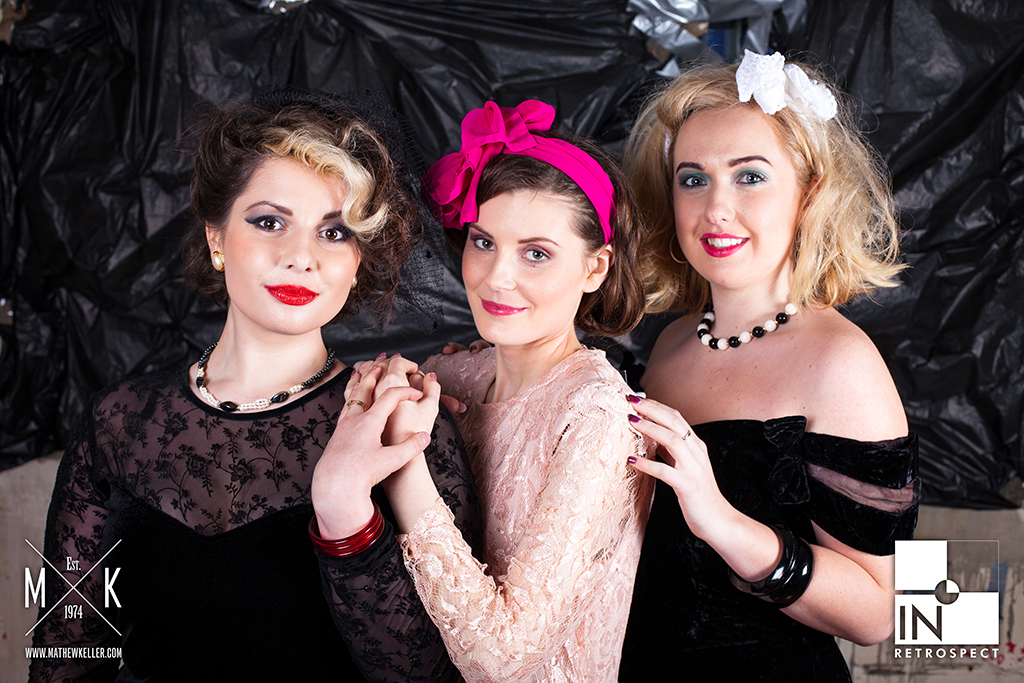
The project used the film’s visual language as a starting point, drawing on 1980s styling, youth culture, fashion portraiture and character-led group dynamics to create a celebratory magazine feature without simply recreating scenes from the film.
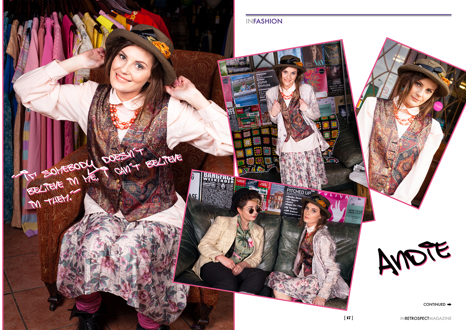
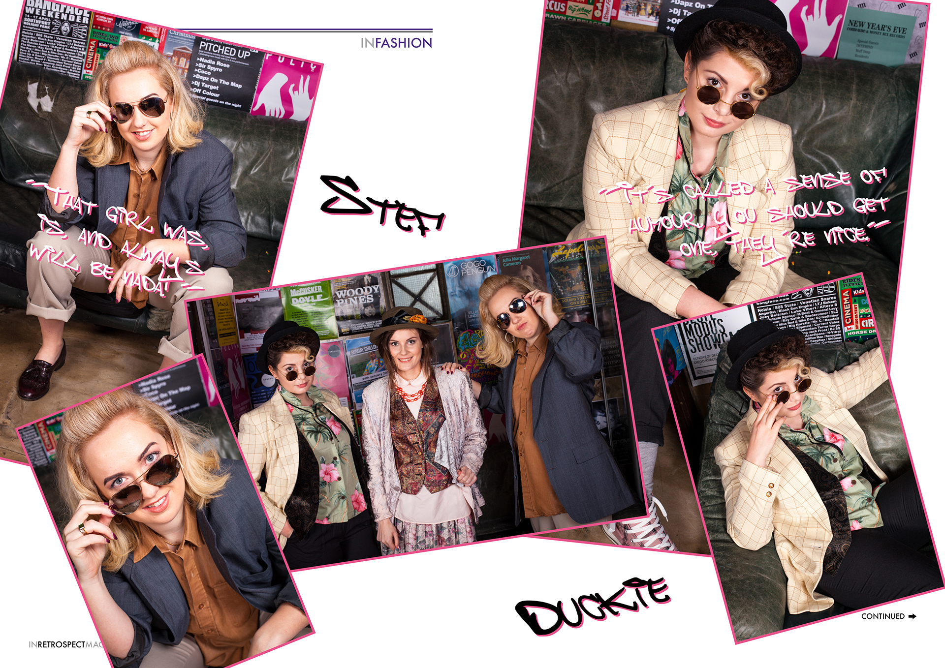
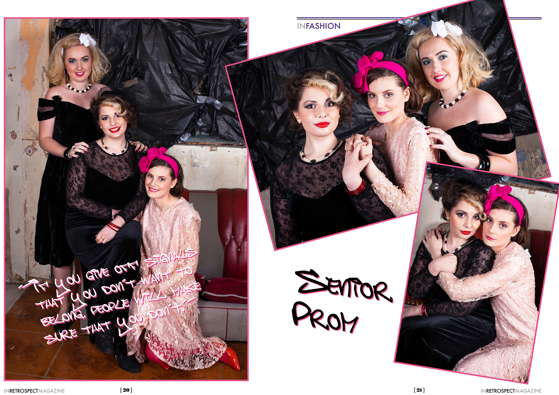
The finished feature appeared in In Retrospect Magazine #06, Spring 2016, bringing together cover imagery, editorial spreads and character portraits.
Role
- Creative direction
- Art direction
- Cover concept
- Fashion and portrait direction
- Styling direction
- Beyond Retro collaboration
- Image selection and sequencing
- Magazine presentation
Anniversary concept
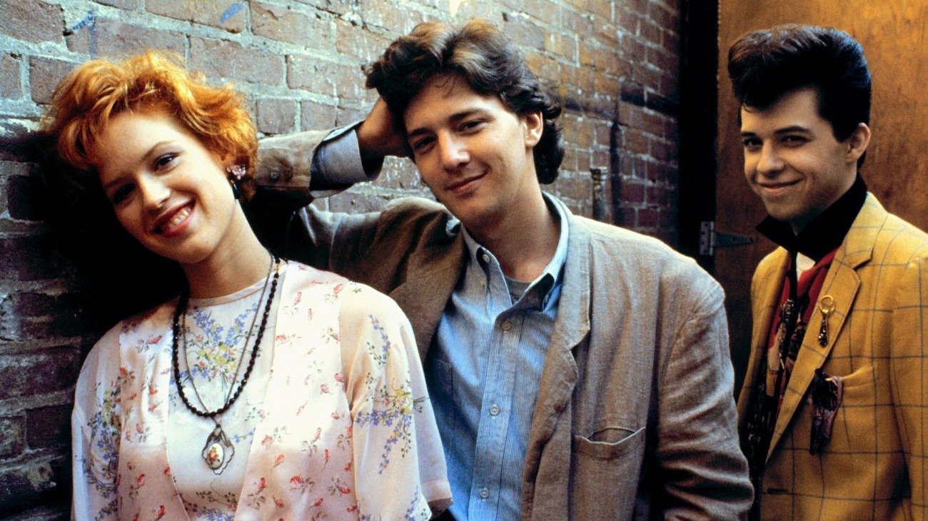
The shoot was built around the 30th anniversary of Pretty in Pink, using the film as a shared cultural reference rather than a fixed template.
Working with Beyond Retro gave the feature access to vintage clothing and styling cues that could carry the anniversary theme, while the direction focused on attitude, pose, colour and group dynamics. The result sat somewhere between homage, fashion editorial and magazine cover story.

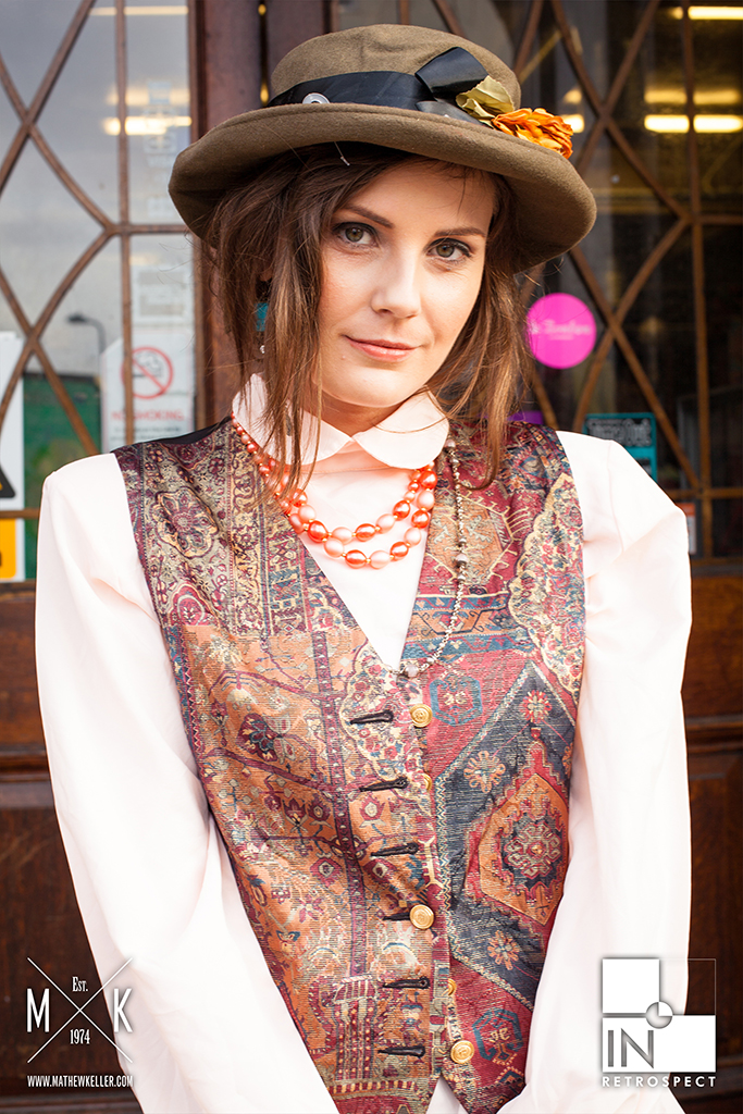
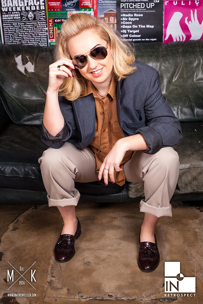
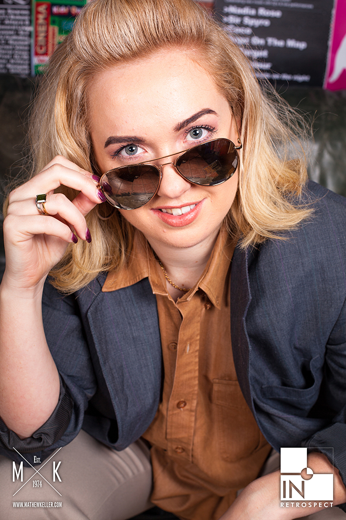
Character portraits
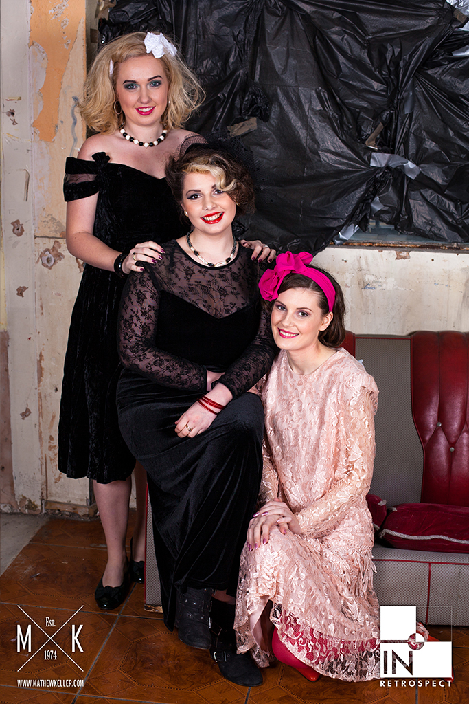
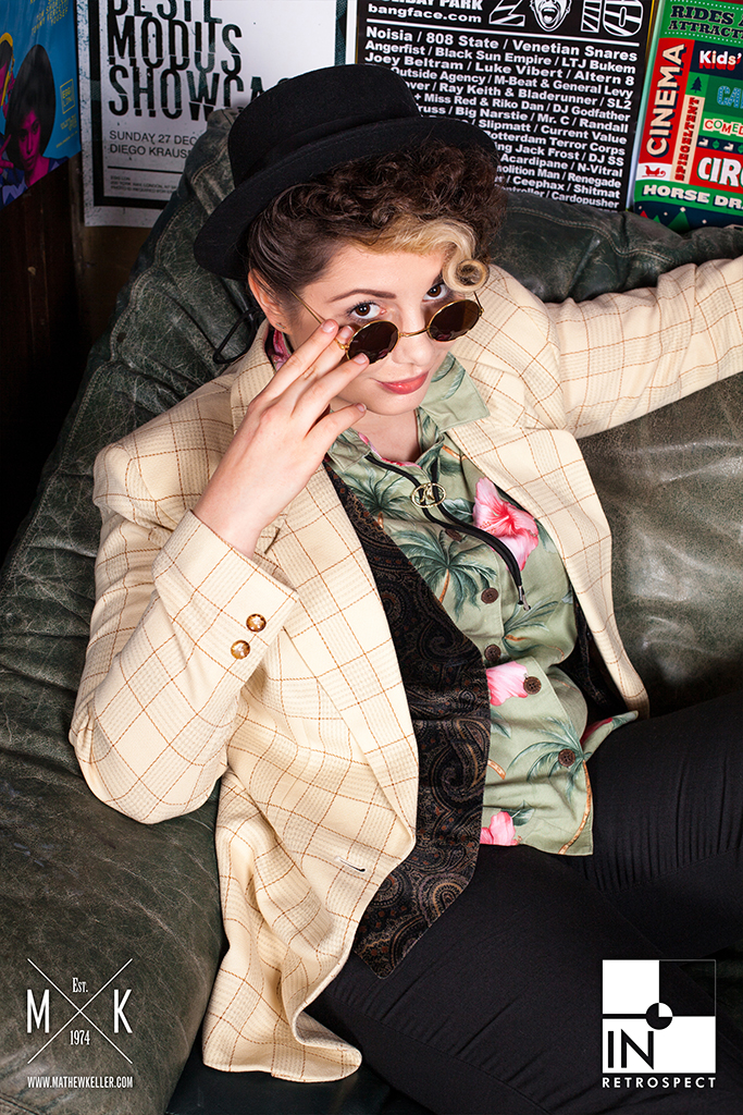
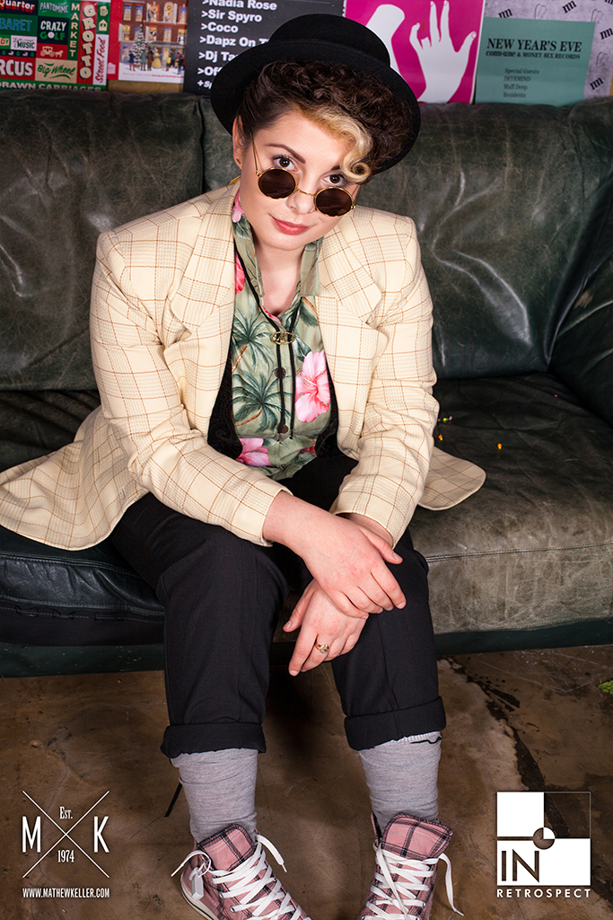
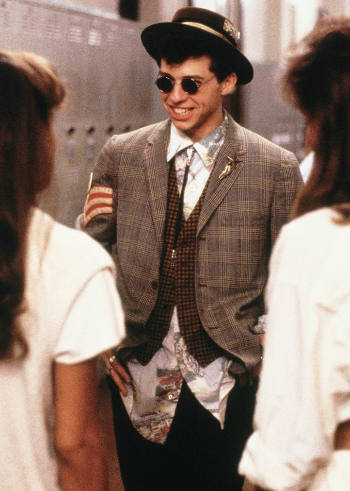
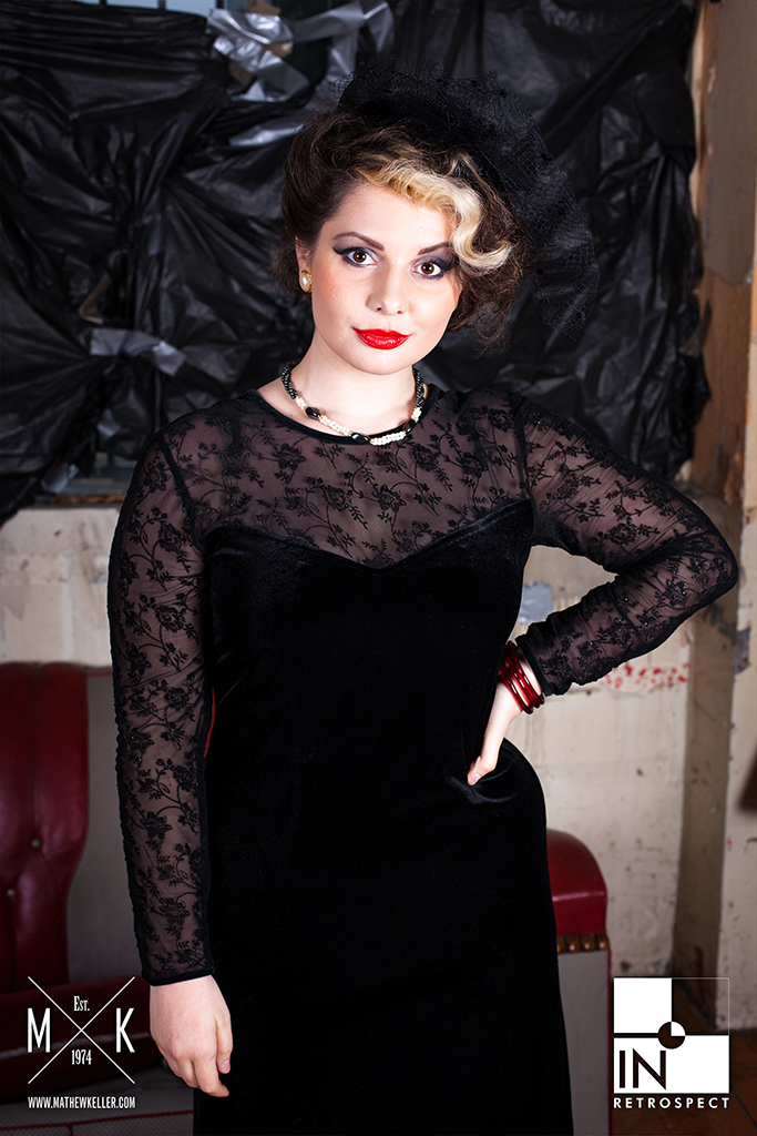
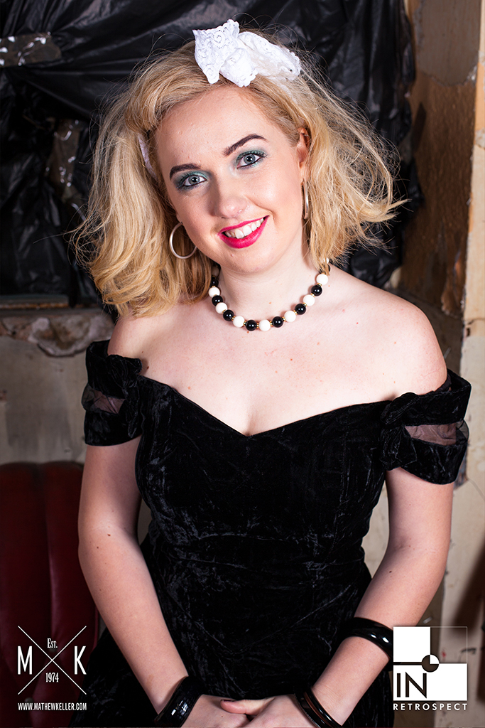
The portrait sets extended the anniversary idea into individual character moments, giving each look its own attitude and visual rhythm.
Some images leaned into the recognisable high-school and teen-film language of the source material, while others pushed the styling into a broader fashion editorial space. Together, they gave the feature more range than a single cover image could carry.


Behind the scenes
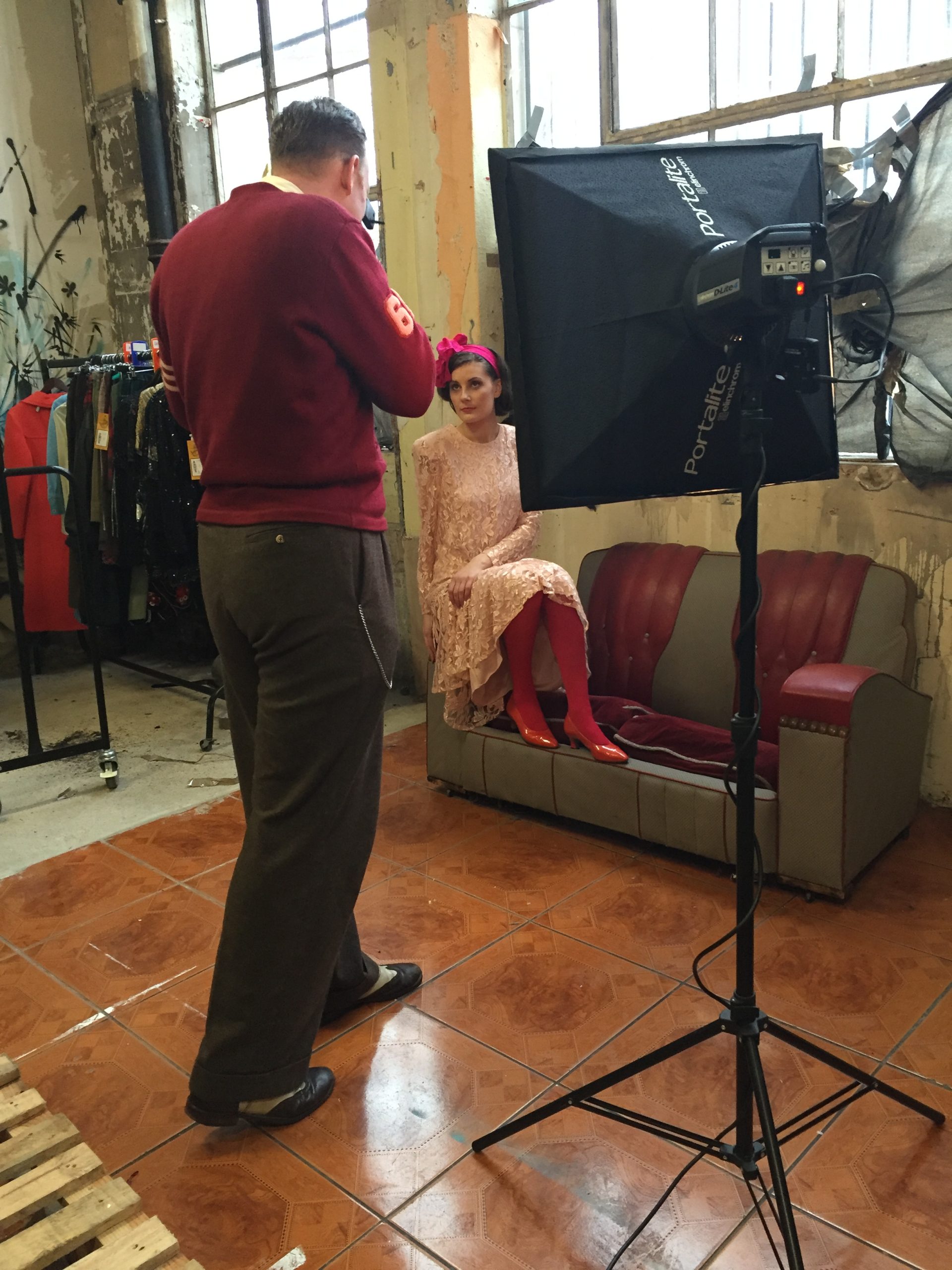
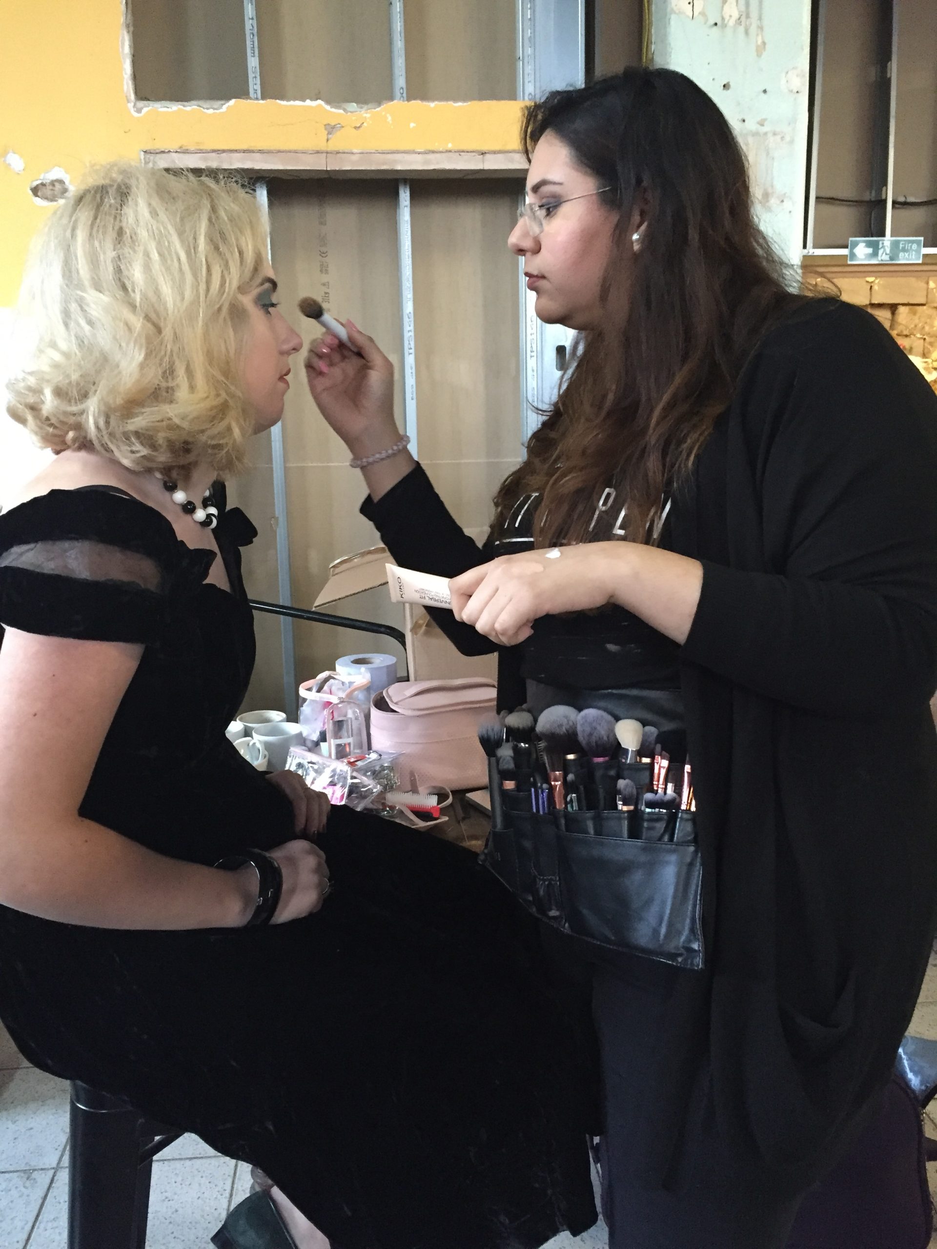
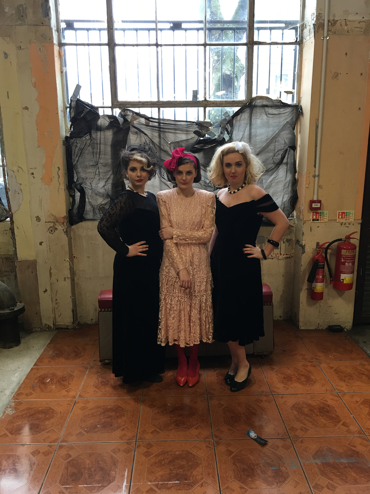
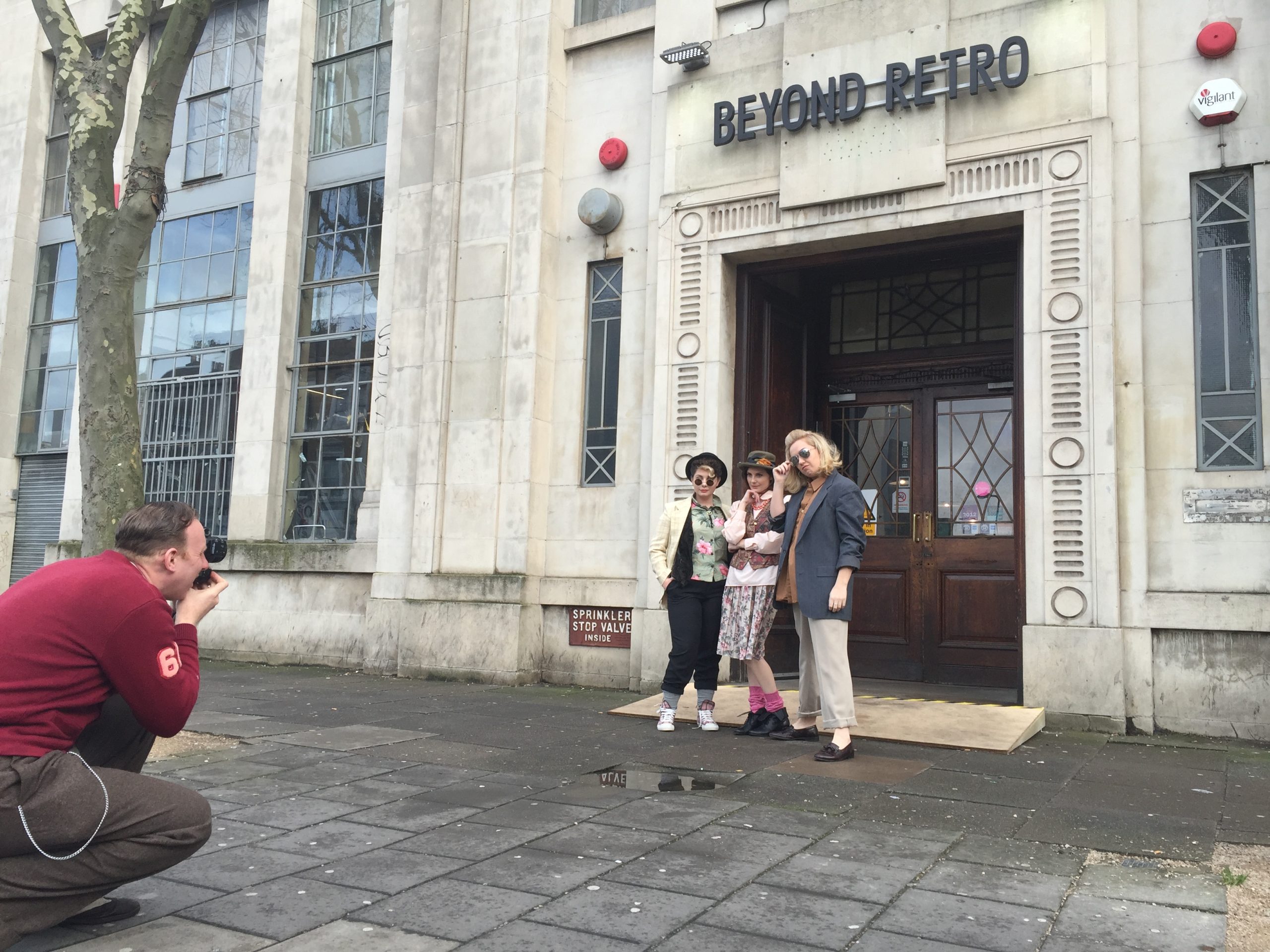
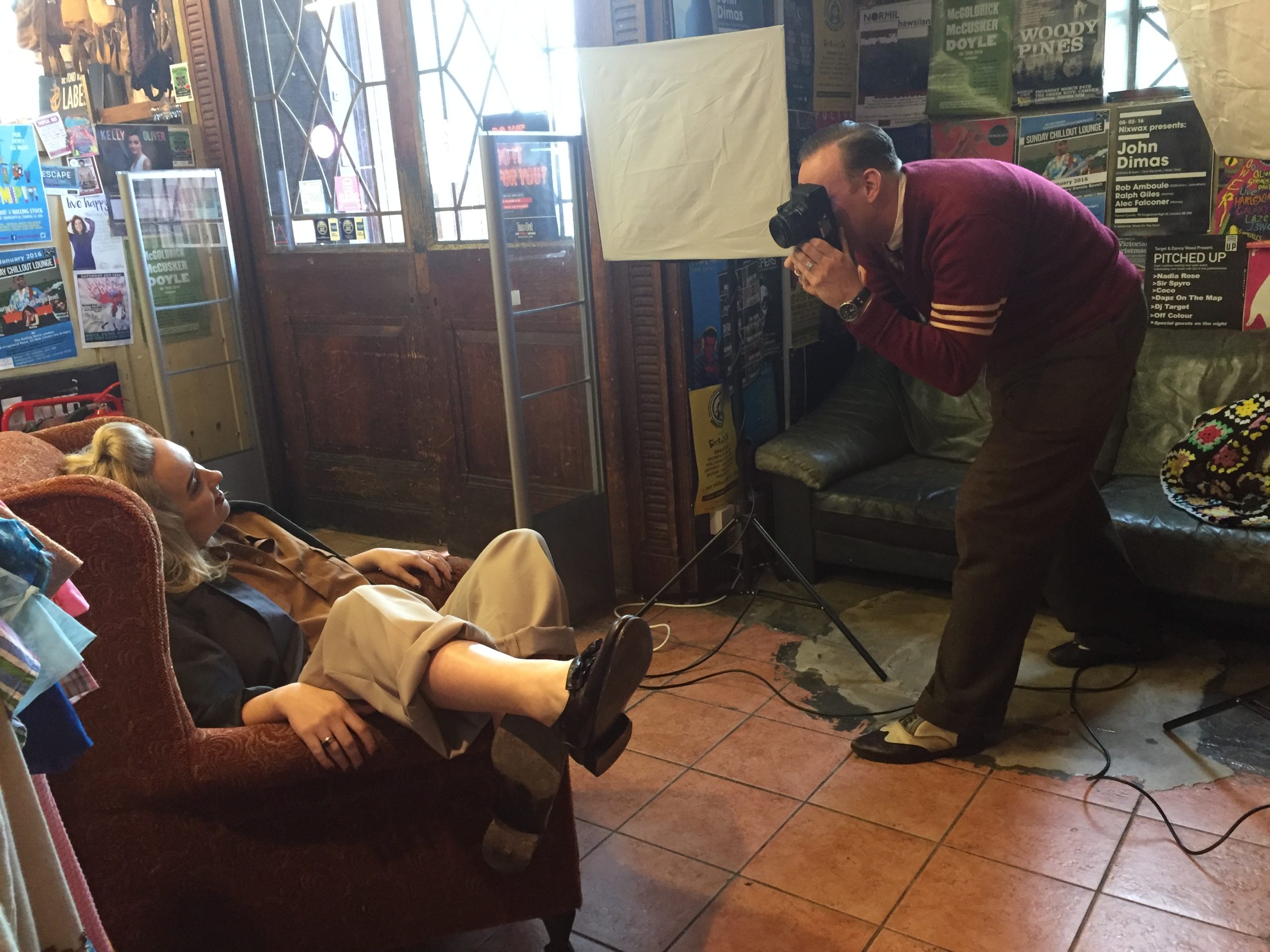
The production images show the shoot taking shape on location, from styling and make-up to lighting, direction and set-up.
They also capture the practical texture of the day: the improvised corners, working space and small adjustments behind the final editorial images.